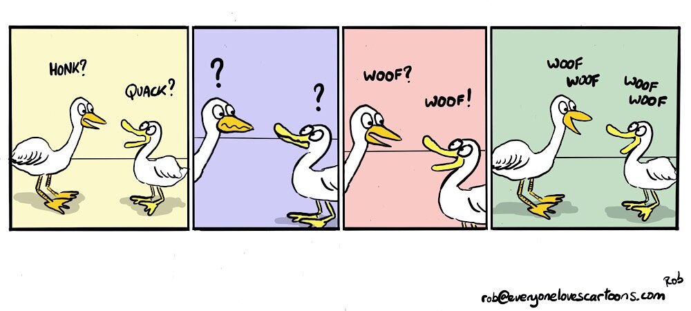
Years ago I went on a trip to Spain with a friend of mine. We travelled by ferry from Portsmouth in the the south of England, to Santander in the north of Spain. It was a bit rough crossing the bay of Biscay, and so neither of us ate much during the crossing. By the time we got to Spain around 3pm in the afternoon, we were both pretty hungry. The only problem was that due to the time of day, there was no where open to eat apart from a McDonalds. The only alternative we could find was a Chinese restaurant.
As it was out first trip to Spain, and neither of us spoke any Spanish, communicating at first proved to be a bit of a problem. The staff spoke no English, and we spoke neither Spanish or Chinese. Fortunately for us, one of the Chinese staff used to work at a restaurant in France and so we were able to speak in French. Two English guys speaking French in a Chinese restaurant in Spain...
Anyway, I toyed with how a couple of animals might care being in a similar situation.
How I came up with the idea
I thought I’d pick a couple of animals that look similar and so I chose a duck and goose.
I’m currently putting together some illustrations to go with the upcoming ‘Storytelling for Cartoon Strips Course.
I wanted to include some examples of how you can tell a story without any words and so I thought this cartoon fitted the bill. (Let’s see how many duck and geese gags I can come up with in the rest of this article.
Initial rough sketch
Even though I’m working digitally here, and I can easily undo errors, I prefer to use a 6B pencil as it just feels more, well, “sketchy”. And that seems to loosen up both my doodling and my thoughts.
Initial layout sketch
I thought this would work over four panels, so I did some quick thumbnails to get an idea of how it would look.
Outlining the characters
I’ve now outlined the characters for each panel. Each pair was drawn on a separate layer. I copied the characters from layer to layer and then modified their features.
Creating the layout
The pairs are still on separate layers, which explains why you can see some of the elements overlapping.
Finalising the layout
I’ve now settled on the layout and erased all the overlapping lines.
Col0uring the characters
I initially toyed with the idea of colouring the characters perhaps with the duck being represented by a mallard. However, I liked the idea of the pair having the commucation problem despite the fact that they looked quite similar. So I decided to keep their bodies white, but to colour their beaks, bills, and feet differently.
Adding shadow
Before I added coloured backgrounds I thought I might keep the use of colour to a bare minimum and just add a little shadow under the characters.
Adding a green background
When I first thought about adding colour to the background, I thought I’d just add some green to imply a natural setting.
Adding the coloured panel backgrounds
I mentioned above that I’m using this cartoon to help illustrate a course on Storytelling for Cartoon Strips. One of elelements of the course is the three act story structure. I thought it would be useful to show how the structure breaks down by colouring each panel differently to represent each act. This example doens’t quite fit into this pattern, but it does help to differentiate what is going on in each individual panel.
Alternative background
I thought I’d try one alternative background with only half of each panel coloured, but I think I prefer the full panel version.
What’s next
In April I’m running the ‘Storytelling for Cartoon Strips Course’. To find out more information what it’s available, add your name, mail, and type ‘story’ in The subject line.


