In this Cartoon Clinic, I’m going to look at a recent cartoon and some ways to improve it.
First Version
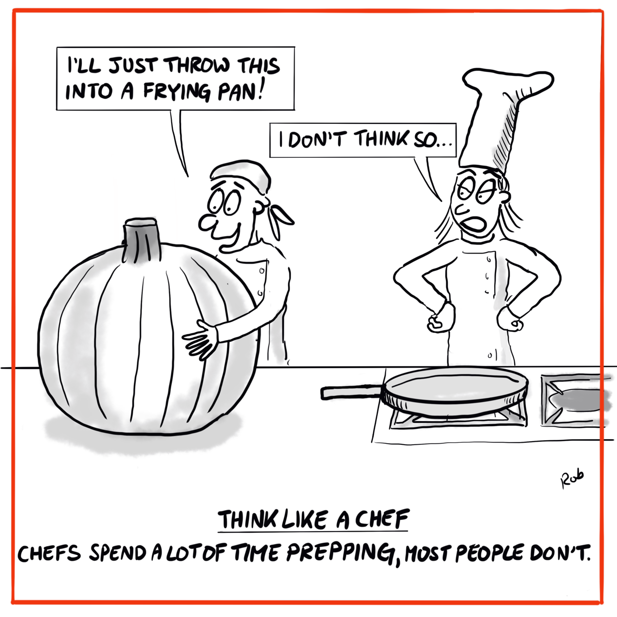
The feedback received was to have a single vegetable and make it way bigger than the frying pan.
Second Version
This looks better than the previous one, however, the frying pan is overlapping the chef.
Third Version
I put the frying pan down on the stove, and placed the assistant’s arm around the pumpkin.
Anything I’ve Missed?
Is there anything else you’d change with the above cartoon?
Here are a few points to ponder:
The characters
The foreground
The background
The speech


