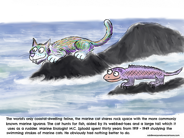
Previously I posted the above cartoon that I wanted to try and improve.
I indentified a few areas to work on:
The cat blends in too much in the sea. I realise that in nature nearly all animals blend in with their environment, however, this doesn’t really help the clarity of the cartoon. So I want to add a darker sea background, and make the cat’s colouration a lot brighten so that it stands out.
There are also too many ares of white on the rocks. I need to make them darker so that there’s no white to catch the eye, and also to help the characters to stand out more.
The cartoon is about the cat, not the iguana. However, at the moment the Iguana is more brightly coloured and so the attention goes to it rather than the cat. It should be the other way around.
Both the cat and the Iguana would benefit from a bolder outline.
I can do a better job with the sea. While it is clear at the moment that that sea is depictured, I think I can make the sea a lot more interesting.
The horizon is too uneven.
Can I work a second gag into the picture?
Here is the amended version:
I’m now going to go through the changes I made step-by-step.
Recolouring the cat
The cat needs to be a lot brighter and more colourful to help it to stand out from the background. To simulate fur, I’m using a technical pen in ProCreate at 30% opacity and then building up all the different coloured lines on top of each other. You can see the pallete than I’m going to use for this version.
Toning down the iguana
In the previous version, the iguana was brighter than the cat. I selected white at 30% opacity and then went over it a few times until the colour was a lot more muted.
Darkening the rocks
I made the rocks darker so that both characters would stand out more.
Changing the sea
I’ve now started reworking the sea. Previously I used a watercolour brush, this time its a turpentine effect as I really like how you can create water with it.
I’ve also smoothed out the horizon line.
Zooming in
One reason I feel that characters merged too much with the sea before was that they were simply too small. The emphasis is on the cat first, iguana second, so its not so important to have too much sea in the background.
The completed cartoon
I went over the rocks with a smudge tool to blend in some of the previous lines, added a little more colour to the cat, and that’s it!
I decided against adding a second gag, as after I’d zoomed in there was less space to play with, and I felt that another gag would distract too much from the two characters.
What’s next?
I put out a Cartoon Newsletter with a whole host of characters as well as cartooning tips. Add your name and best email address to the orange box below and I’ll wing a copy your way.


