Today I’m going to talk about using contrast to produce striking cartoons. As well as this, I’ll talk through the different steps in creating a recent cartoon.
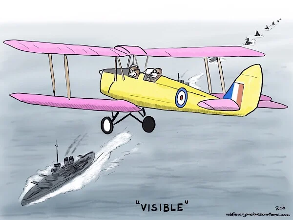
Above is the completed cartoon as it finally appeared. This one was produced as part of a ‘word of the day’ challenge that I took part in on a cartoon forum.
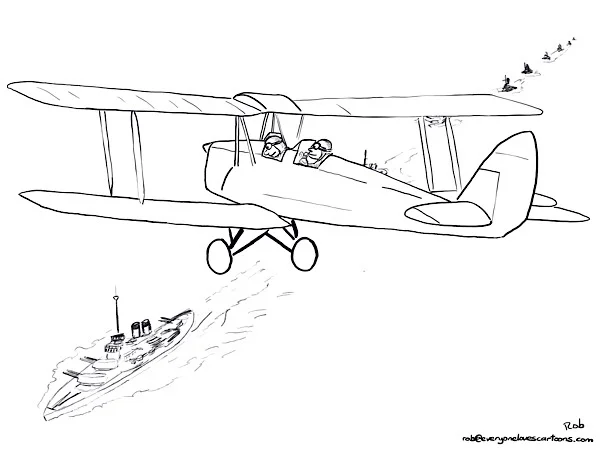
Here is the initial outline. I used a couple of different reference photos, one of a Tiger Moth biplane, which was used to train RAF fighter pilots in the 1930s and 1940s, and the other photo of a fleet of Battleships at sea.
I thought it would make for a striking image to have the plane bisecting the column of ships.
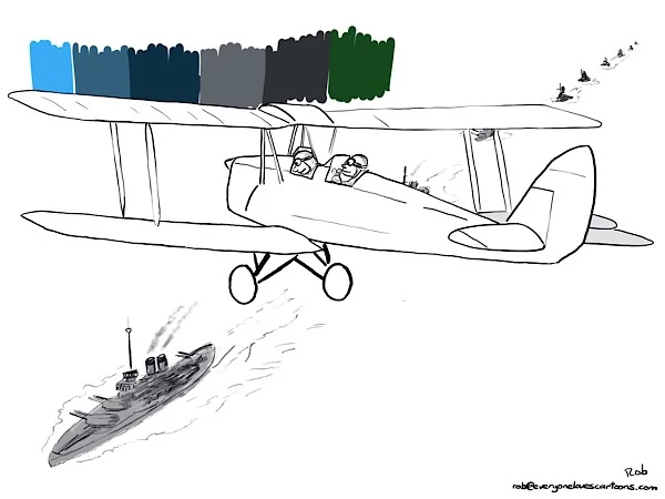
Here I’m preparing to colour the sea. I’ve created a palette of sea tones on a separate layer. At apply the tones I’m going to use a digital watercolour brush in procreate.
Next I’m going to colour the biplane, I’ve created a new palette choosing bright colours to contrast against the sea. I also wanted the pink and yellow to contrast with each other for extra effect.
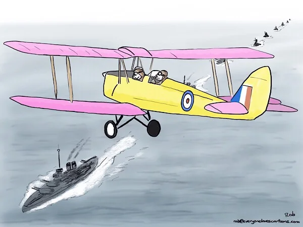
The colours are now all in place. Next I’m going to add some shading and hatching to add more form to the biplane.
Aaa
And here is the completed cartoon again. For an even stronger contrast I could make the sea a lot darker which would really help the brightly coloured airplane to stand out.


